Logo mistakes. They’re unavoidable…right?
Wrong.
Since pivoting to work with the 9-5 girlies who want to have their cake and eat it, too, these days, a lot of the women that I have discovery calls with are coming to me with branding that they’ve gotten from online platforms like Fiverr, Upwork and 99designs (and even Facebook Marketplace…who knew!?).
And while I’m not here to knock anyone’s budget (this is a judgment- and shame-free space), we do need to talk about some of the logo blunders that I’ve seen popping into my mailbox as of late.
Why?
Because not only is it my sworn duty as a brand designer to elevate your side hustle, but also because I refuse to believe that budget-friendly design has to equal bad design.
So, in no particular order (except for #1 of course), here are some common logo mistakes to avoid at all costs:
Logo Mistake #1: Design that lacks strategy
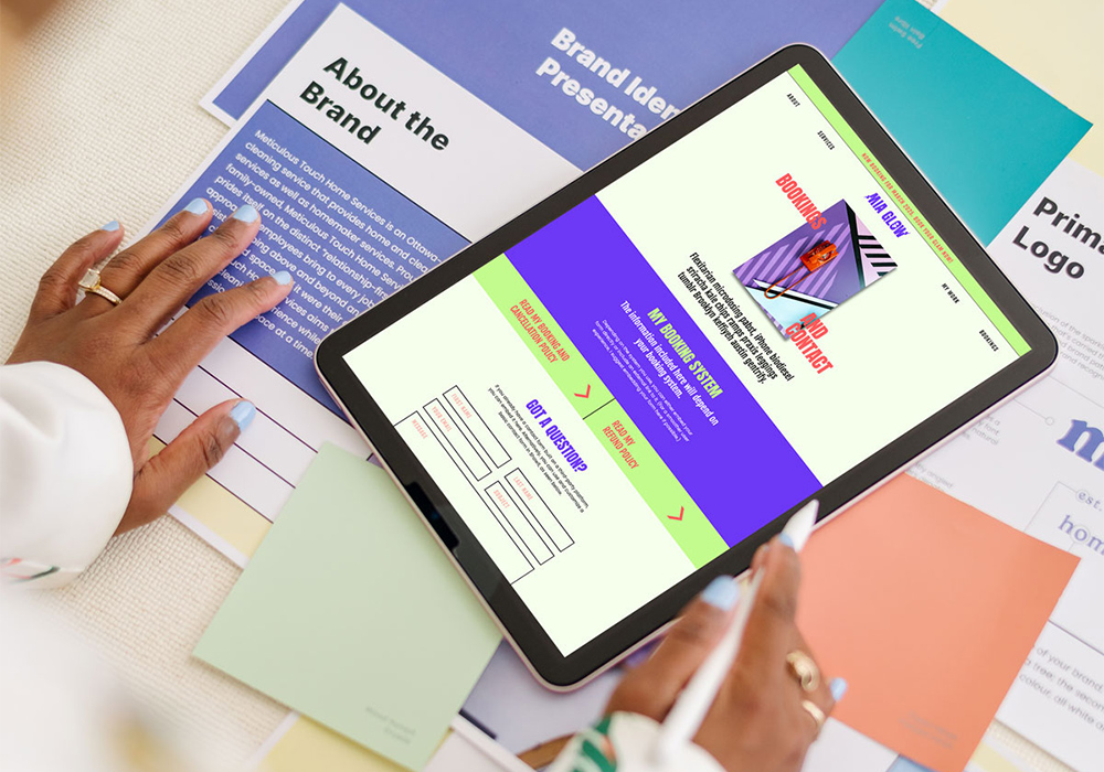
Your logo is a visual expression of your brand strategy, and when done right, it should communicate who you are, what you have to offer and what sets you apart. So, unsurprisingly, a logo without a strategy is likely to miss the mark in this area. But not only will a strategy-lacking logo fail to convey these things, but it’s also likely lead to mixed messaging, poor brand recognition and a need for constant revisions (which costs time and money). As I talked about in my last blog post, before you hit the ground running in your side hustle (that includes investing in a designer), it’s important to take a beat and think about your strategy.
Logo Mistake #2: No originality
A good logo is memorable and easily recognizable.
One of the fastest ways to lose brand recognition is to have little-to-no originality in your branding. While it isn’t always possible, your logo should avoid icons and illustrations that are generic, unoriginal and played out. For example, if you’re a yoga instructor, rather than incorporating a lotus flower into your logo, consider a custom and abstract icon that represents your brand values. (I did this in a past project and it was a total hit with the client!)
![]()
The logo design for Rosie Moore was intentionally designed as a visual expression of the brand’s strategy. Check out the case study here.
Logo Mistake #3: Overly complicated design
Building on the second logo mistake, as much as you want your logo to have some originality, you don’t want it to be overly complicated. Think about some of the world’s biggest brands, like Apple, Nike, Amazon and Google. What do their logos have in common? Simplicity. Overly complex logos can be hard to read and replicate, which can lead to inconsistency in your overall marketing. Be sure to avoid designs with too many fonts, overly done effects like drop shadows and gradients, and competing colours.
Remember: When it comes to logo design, less is more – and best.
Logo Mistake #4: Lack of versatility
Your logo should come in at least three variations (a primary logo, secondary logo and brand mark), so that it can be used in different mediums while still maintaining consistency. For example, your primary logo, which is usually the largest, is ideal for a business card, whereas your secondary logo or brand mark, which are both smaller, would be perfect for your social templates. Sizing aside, your logos should also have versions in all black and all white for legibility and accessibility purposes.
This blog post does a great job of breaking down the importance of a versatile branding suite.
Logo Mistake #5: Disproportions
Good design respects proportions – spacing, weight and the size of elements in relation to one another. A lot of logos have to include the business’ name, an icon, illustration or tagline, which can be a lot to cram into a single logo (hence logo mistake #4). To make sure the logo is easy to read, everything needs to be balanced. A great way to create this balance is to make the most important parts of your logo, like your business’ name, bigger, and less important parts, smaller.
So, there you have it! What do you think? I’d love to hear your biggest takeaways from this email — drop your thoughts in the comment section below.
And of course, if you’re ready to ditch the Fiverr life and give your side hustle the main-gig treatment, so am I. Fill out my contact form here, and let’s get started!


Your blog is a shining example of excellence in content creation. I’m continually impressed by the depth of your knowledge and the clarity of your writing. Thank you for all that you do.